Emissions by Country: Who Emits How Much CO₂?
6 minute read
Updated on: 26 Apr 2021
https://climatescience.org/advanced-emissions-by-country/
Climate change is a global problem, but some countries have contributed more to emissions than others ![]()
![]()
![]() .
.
Since complete data on CO₂e for all countries is not yet available, we will focus on CO₂ emissions— the greenhouse gas that makes up 74.4% of human emissions ![]() .
.
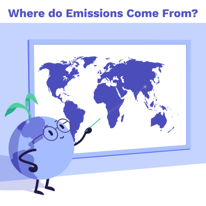
Where do emissions come from?
Which countries produce the most CO₂?
Most data comparing emissions between countries looks at production-based emissions - those produced within a country’s boundaries ![]()
![]() .
.
Today, China is the world’s largest CO₂ emitter and accounts for more than 25% of global emissions. This is followed by the USA (15%), the EU-27 & the UK (10%), India (7%), and Russia (5%) ![]() .
.
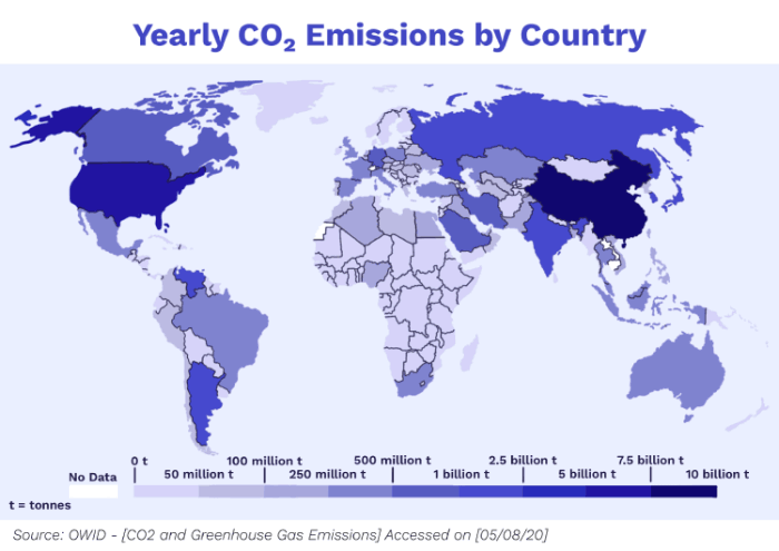
Annual CO₂ emissions across the world, measured in tonnes per year (2017 data) ![]()
The USA has contributed most to overall global CO₂ emissions, accounting for 25% of the human-released CO₂ that has built up in our atmosphere to date. ![]() . This is followed by EU-27 & the UK (22%); China (13%); Russia (6%) and Japan (4%)
. This is followed by EU-27 & the UK (22%); China (13%); Russia (6%) and Japan (4%) ![]() .
.
These stats look at countries as a whole, but what about individual citizens?
Which countries produce the most CO₂ per person?
Per capita emissions are the amount of greenhouse gas emissions per person in a country. This is calculated by dividing a country’s total emissions by its population ![]() .
.
In 2017, Qatar had the highest per capita emissions at 49 tonnes (t) per person ![]() .
.
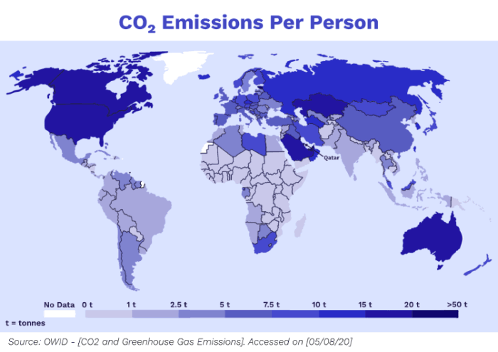
Per person CO₂ emissions across the world, measured in tonnes per year (2017 data) ![]()
The world’s largest per capita CO₂ emitters are the major oil-producing countries; particularly those with relatively low population sizes. This mostly includes countries in the Middle East ![]() .
.
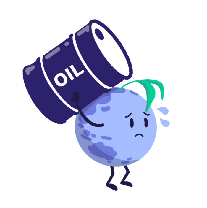
Per capita emissions are highest in oil-producing countries
There are also countries with higher populations and high per capita emissions, such as Australia, USA, and Canada ![]() .
.
Many countries in the world, however, have very low per capita CO₂ emissions. Examples include many of the poorest countries in Sub-saharan Africa, such as Chad, Niger and the Central African Republic ![]() .
.
The average carbon footprint in these countries (i.e. how much carbon they release into the atmosphere) is 0.1 tonnes of CO₂ a year ![]() , 160 times lower than the USA, Australia and Canada
, 160 times lower than the USA, Australia and Canada ![]() .
.
How is this related to income?
There is a strong relationship between income and per capita CO₂ emissions ![]()
![]()
![]() . However, there can be large differences in per capita emissions even between countries that have similar standards of living
. However, there can be large differences in per capita emissions even between countries that have similar standards of living ![]() .
.
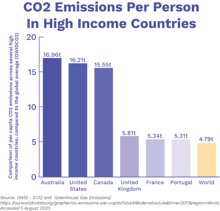
Comparison of per capita CO₂ emissions ![]()
This graph shows the per capita emissions of a range of high-income countries. The UK, Portugal and France have values not that dissimilar to the global average ![]() . This links to choices of energy - these countries produce a higher share from nuclear and renewable sources
. This links to choices of energy - these countries produce a higher share from nuclear and renewable sources ![]() .
.
What about trade?
CO₂ emissions are typically measured on the basis of production ![]() . However, goods are often traded between different countries.
. However, goods are often traded between different countries. ![]() .
.

Goods are often traded between different countries
CO₂ emissions can instead be measured as ‘consumption-based emissions’, which are adjusted for trade ![]()
![]() . This involves tracking which goods are traded across the world. Whenever goods are imported we need to include all CO₂ emissions that were emitted in the production of that good. Similarly, we need to subtract all CO₂ emissions that were emitted in the production of goods that are exported
. This involves tracking which goods are traded across the world. Whenever goods are imported we need to include all CO₂ emissions that were emitted in the production of that good. Similarly, we need to subtract all CO₂ emissions that were emitted in the production of goods that are exported ![]()
![]() .
.

Calculation of consumption-based emissions ![]()
‘Consumption-based emissions’ can be quite different from ‘production-based emissions’, ![]()
![]() and tend to reflect the consumption and lifestyle choices of a country’s citizens
and tend to reflect the consumption and lifestyle choices of a country’s citizens ![]() .
.
The map below shows the emissions of traded goods in relation to the country’s production-based emissions ![]() . Countries shown in orange are net importers of emissions; in other words, more CO₂ emissions are released in the production of the goods they import than in those they export.
. Countries shown in orange are net importers of emissions; in other words, more CO₂ emissions are released in the production of the goods they import than in those they export.
Countries shown in blue are net exporters of emissions; more CO₂ is released in the production of goods that are then exported than in the products that are imported.

CO₂ emissions in trade ![]()
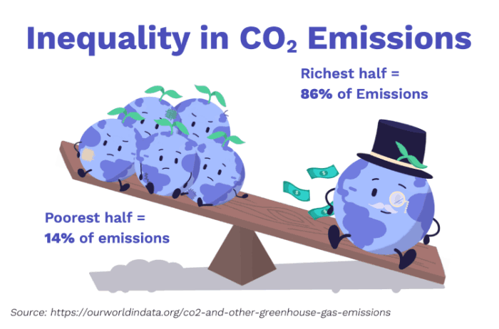
Inequalities in CO₂ emissions
The richest half of the world’s countries (high and upper-middle income) emit 86% of global CO₂ emissions ![]() . The poorest half (low and lower-middle income) emit only 14%
. The poorest half (low and lower-middle income) emit only 14% ![]() .
.
The very poorest countries are responsible for just 0.5% ![]() !
!
Emissions are not equal
This only takes into account the inequalities between different countries. It is estimated that emission inequalities between people living in the same country can be just as large ![]()
![]() .
.
Conclusions
We have learnt that the cause of climate change is humans releasing greenhouse gases into the atmosphere. However, some humans are more responsible for these emissions than others.
Climate change is an issue that will affect people all across the world and we all need to work together to try and reduce its impacts!
https://climatescience.org/advanced-emissions-by-country/